Cycler

Rebranding and New Website for Insurance Company

Naked Creativity has enjoyed a close working relationship with Next Gen Insurance on a retainer basis since 2019, supporting all their web and design needs. Recently the company made a decision to rebrand their insurance products and focus on their core cycle insurance product, renaming the company Cycler. Naked was delighted to be selected, once again, to roll out this exciting rebranding programme and deliver a new website for Cycler.

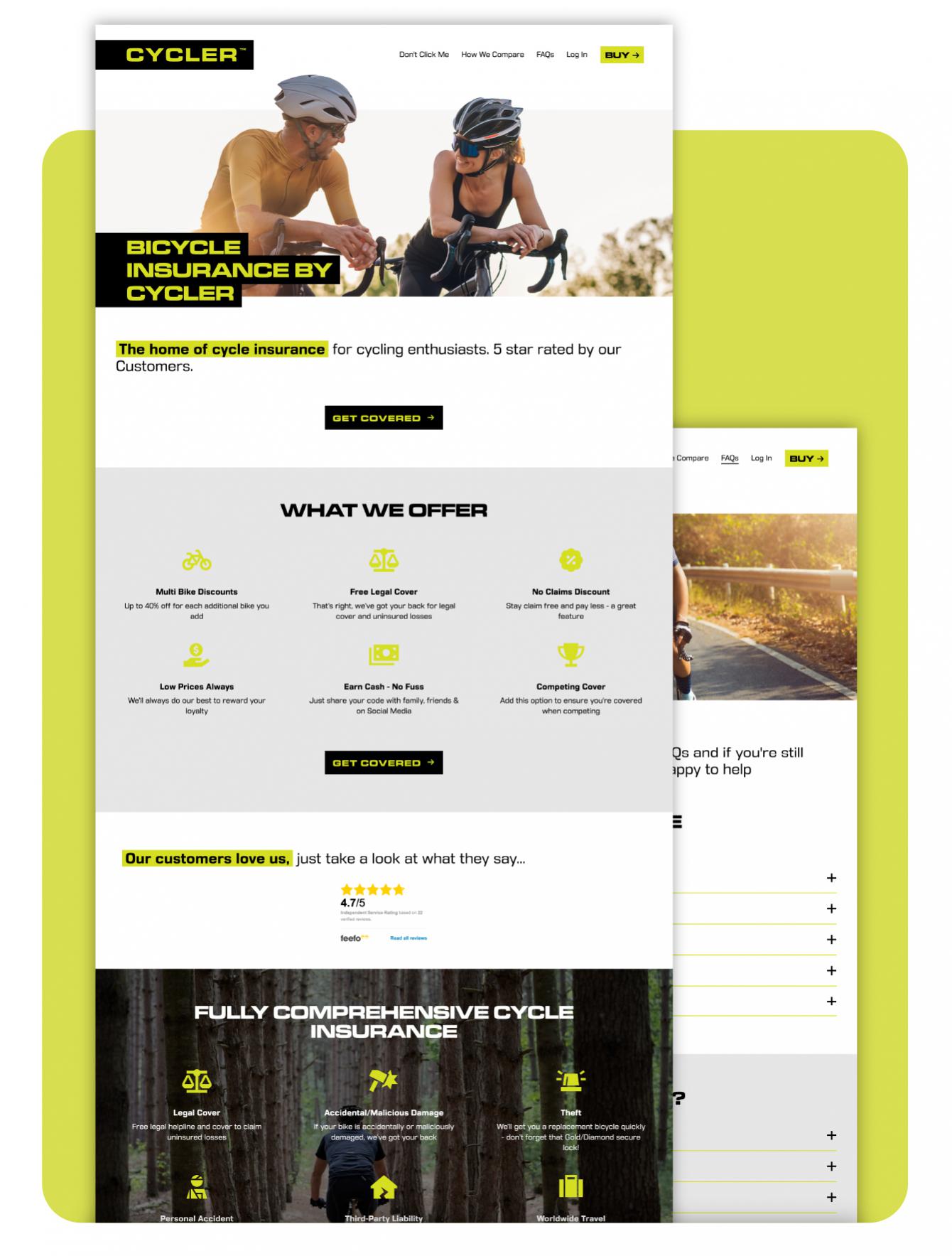
Starting from scratch, Naked’s designers came up with concepts for a new logo and brand identity. With existing insight into the insurance market, the team worked with the client to create their vision of a bold, punchy brand that would stand out from other cycle insurance products. A contemporary style font was chosen for the logo and heading text to give it a fresh, impactful appearance. This was paired with a complimentary body font which was clear and easy to read. In a nod to their Next Gen roots, the original yellow colour was chosen from Next Gen’s branding - this was contrasted with black to create maximum impact.

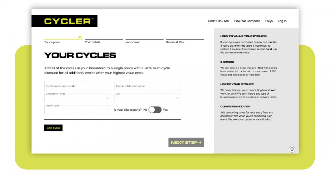
Once the branding was finalised, the team then worked on developing a new website, ready to launch the new product. With the advantage that Naked had created the original insurance ‘quote and buy’ website, the team were able to keep the existing functionality of the website and just needed to reskin the visual interface of the website. This meant applying the new branding throughout, as well as adding additional visual interest to the banner images, by cutting out the foreground from the background to make them more striking.

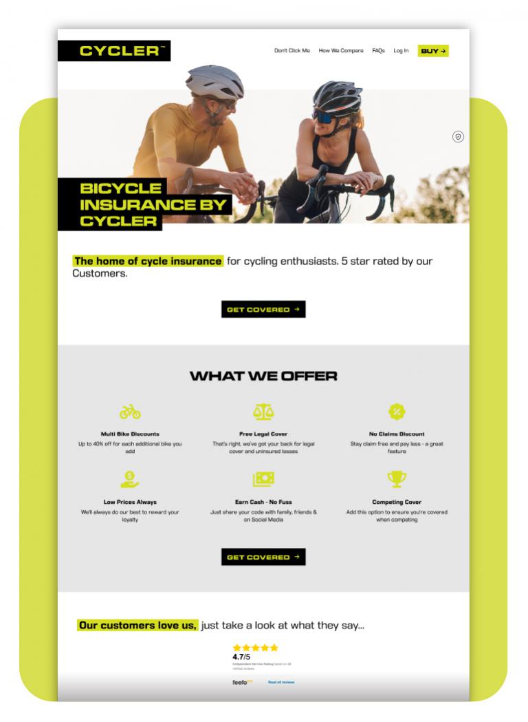
The Cycler desktop website homepage - mobile

As Cycler had several co-branded partner pages, the team also had to consider a mechanism for customers coming from partner websites or targeted advertising and how these linked to the Cycler ‘quote and buy’ system.

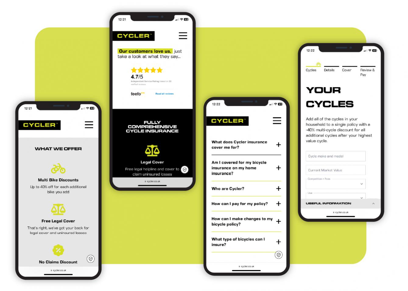
The website was built on Naked’s Cee.ms - a bespoke content management system that enables Cycler to edit the layout and content themselves, with simplicity. The flexibility of this system meant that Cycler could refine or easily add pages to expand the website as necessary in the future. The website was designed to be responsive, so customers could view the website on all screen sizes and different mobile devices, for both browsing and purchasing.

Having worked with Naked Creativity for some years and understanding their deep technical expertise, their eye for design and their ability to deliver, it was clear to us who the development partner needed to be to deliver a brand change and refresh. The team managed all aspects from brand design, scope, implementation and post release testing. The new website and underlying back office capabilities were delivered on time and within brief. We’re now trading under the new brand and continue to be supported by the team.

Alan Hickman, Founder of Cycler

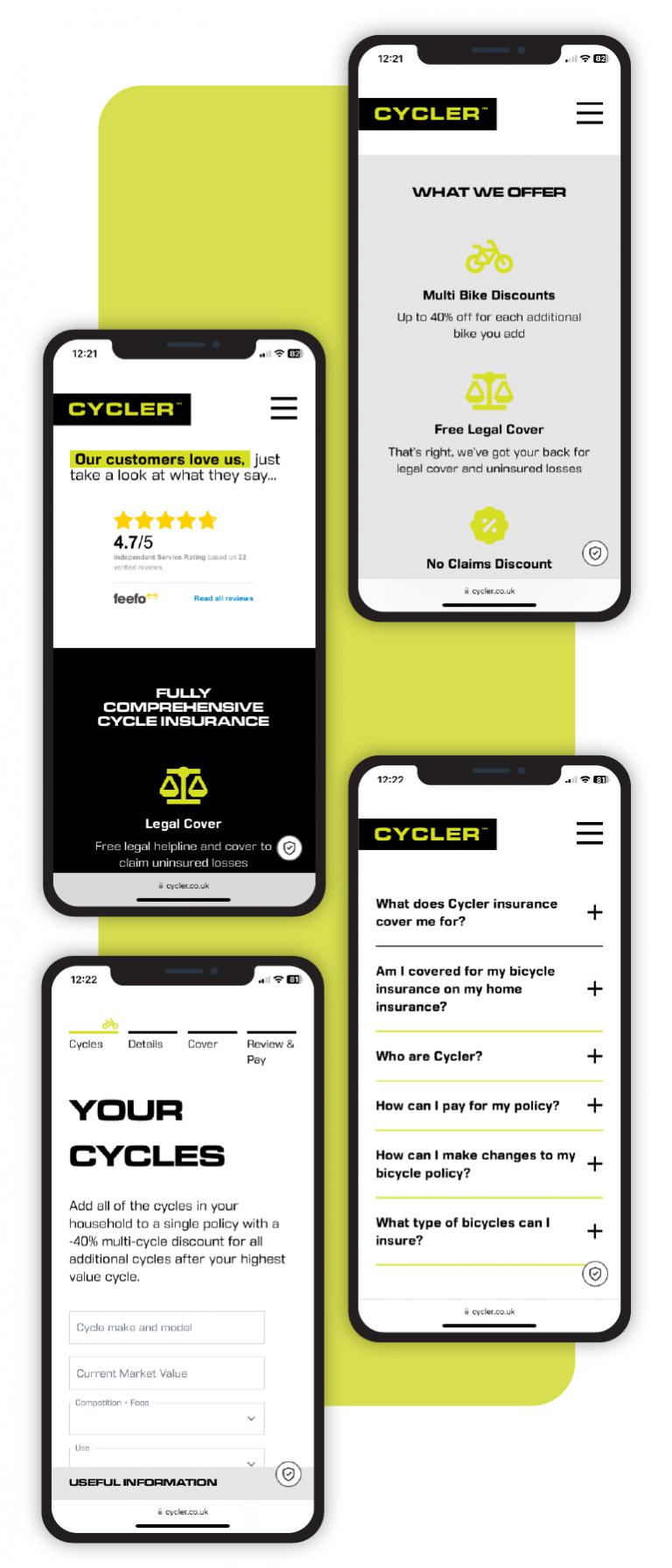
The Cycler website on a mobile device - mobile

Naked’s team was delighted to support the launch of Cycler’s new brand, meeting expectations and delivering on time. As well as this, the team continues to work on a retainer to support Cycler’s technical needs as their brand grows.

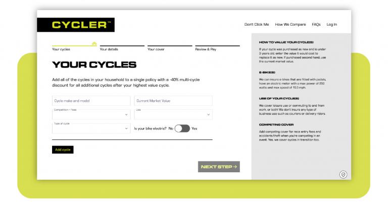
A screenshot of the quote and buy engine on Cycler - mobile